BarcelonaAccidents 2010-18
Yes, I let myself go and get sucked in by my origins. I just had to work on a database that is from my hometown (Barcelona) as a modest way to show my support to the fellow Catalans in these sad days (‘Stay strong and together’)
I obtained all the information thanks to openData Barcelona. All these file are easily available in BarcelonaOpenData

Brief description of Barcelona Accidents.
- Dataset contains all the accidents that the local police attended from 2010 to 2018.
-
The information is gathered and spread in different files: - Accidents. This one has all information about every single accident and its time (date and time) and location (street, district, longitude and latitude). It also gives detailed information about the victims of the accident: how many in total were involved and what type of injuries they had: minor, severe or death. It also gives us the number of vehicles involved in the accident. Finally, there is a column that explains what the role of the pedestrian in the accident if in any case it was one involved. - Causes of the accident. This one adds ‘initial_street’ and ‘mediate_cause’. While the meaning of the first added column is unclear and will need further analysis, the second one -‘mediate_cause’ - indicates the reason - if any - behind the accident (alcohol, drugs, weather, etc). - People. This file contains the information for every single person involved in the accident. What vehicle they were in (car, motorcycle, etc), gender, age, his/her role in the accident (driver, passenger or pedestrian), if he/she was present or not and lastly what injuries suffer and if he/she was treated or not. - Types. This CSV adds a file named ‘accidents_description’ and it describes the type of accident: tun over, collision, crash, etc - Vehicles. This one adds a more detailed information about the vehicle: apart from type (car, bus,etc), it considers the brand name, model, color, what type fo license was holding the driver and finally for how long that driver has been holding the license.
- It has been a hard work to combine all different CSV due to different encodings and column’s names.
- Once I have all data combined, I will analyze the accidents as a whole and, at the same time, the accidents in which people died. I will compare both (all accidents and deadly accidents) to see if there is something we can learn about them and to see if they are correlated somehow.
- Important consideration: the accidents where people died represent 0.27% (just I did not miss any comma) of the total. It haas two conclusions: this is very imbalanced dataset and any change in the number of deaths even by one accident can change its statistics significantly.
- The link on GitHub for a more detailed and technical explanation is available here:BarcelonaAccidents. I will keep on updating them as I move forward.
Non-technical description of BarcelonaAccidents.
Gathering the data.
First I combine all files for accidents, causes, people, types and vehicles from 2010 to 2018. Once done, I merged them all together using the number of case file as a common index. You can see the coding in BarcelonaAccidents
DATA ANALYSIS
I will start with the most basic information contained in the first file, time, location, number f vehicles, number of people affected and its injuries to finish with the pedestrian cause (reminder: only those in which Barcelona local police is involved) like location, time, number of vehicles, number of people implied and the degree of its injuries.
Time Based Analysis
- Year.
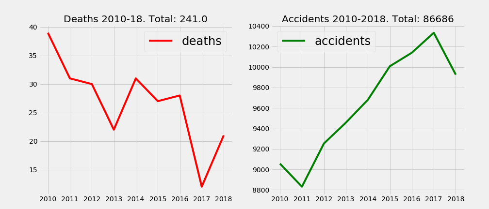
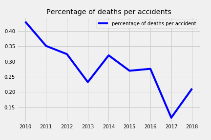
The trend is clear in both cases; while the accidents have been increasing during last years up until 2018 where the were reduced, the number of people that lost their lives in those have clearly diminished except for 3 years: 2014, 2016 and 2018. A more detailed analysis show how the ratio deaths per accidents spiked for 2018.
- Month.
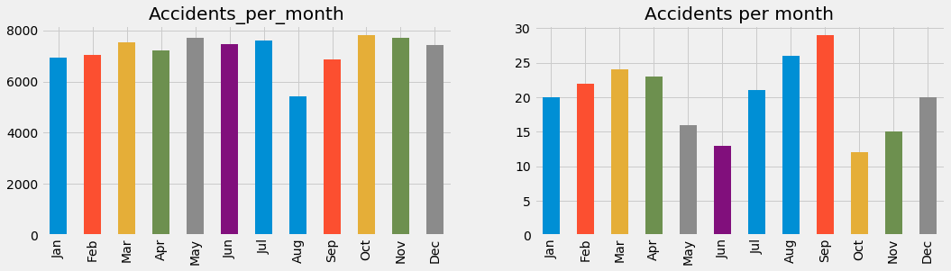
In the graph, we can see how the number of accidents keep steadily during most part of the year except for July and August where they clearly go down. When it comes to analyze deaths, the picture changes. While it looks like the previous months to summer it slows down ( less people dying), it peaks in summer to then go down again.
- Weekday.
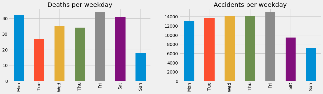
Do you see how the accidents grow constantly during the week to reach its maximum on Friday and then go down during the weekend? Well, when it comes to deaths the analysis is that weekends are the days with the highest numbers of deaths while Monday… What does it mean? Isn’t it strange to see Monday so high out of nowhere?
- Weekend.
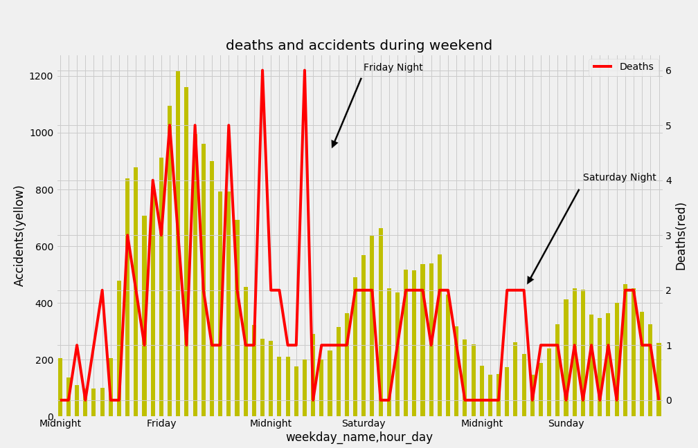
In this case, we can see how the line representing the number of deaths, peaks up on Friday night and also on Saturday night but not as much. This is important to point out because this explains why Saturday stands out in the number of deaths. Saturday includes the late hours of the Friday night and early hours of Saturday night. But if we understand Friday night as the hours from Friday 10pm to Saturday morning 5am, Friday should stand out as the most dangerous hours of the week.
- Hour.
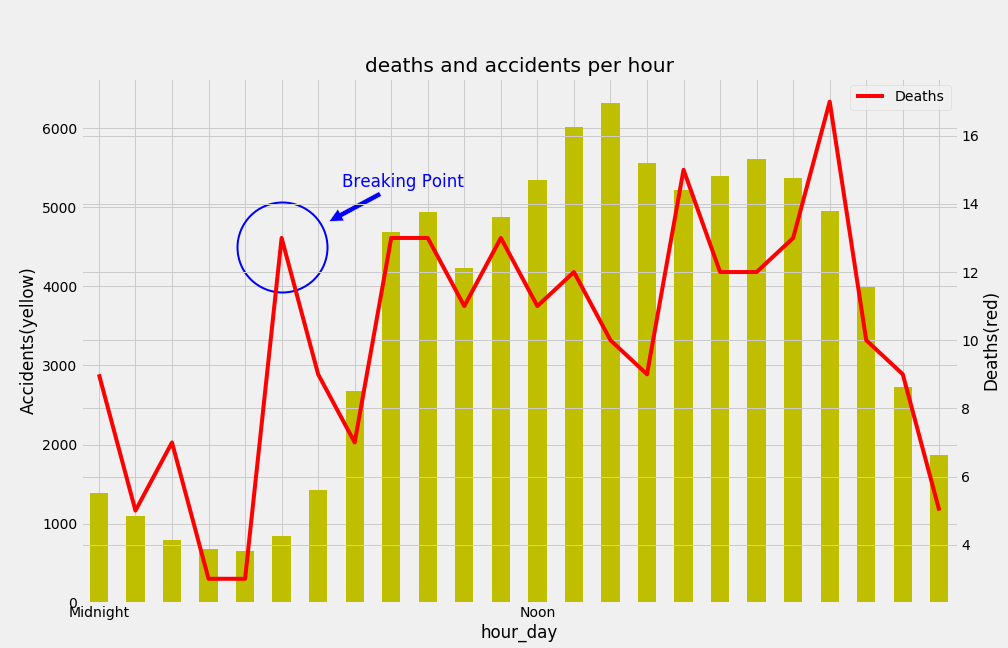
This new chart is confirming all that we have been seeing so far. It is that the riskiest time to drive in Barcelona is during the early morning mainly during the weekend. The first chart, similar to the one we had for the weekend, shows that correlation broken between accidents and deaths.
- Shift
Doing the analysis by shift, it is a little bit overdoing it but I think it will give a clearer picture of the non-correlation in hour for accidents as a whole and the ones with people dying. As a reminder: morning goes from 6am to 2pm, afternoon/evening up until 10 and the rest is night.
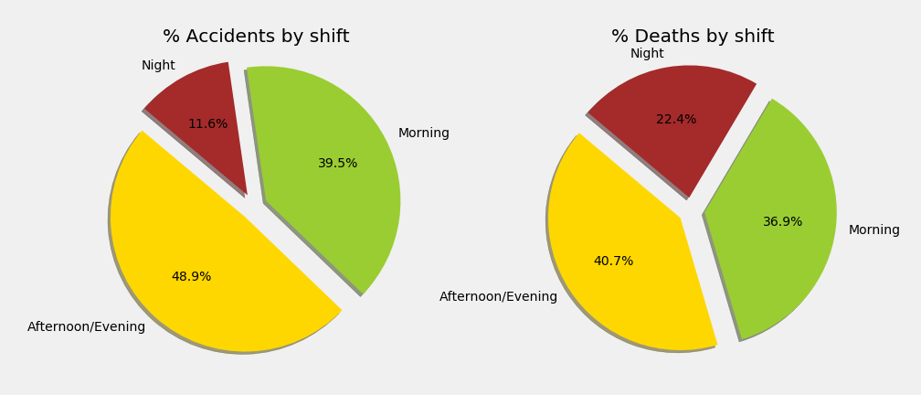
Conclusion: All these charts (and others that I could plot) show how the accidents as a whole are more related to the traffic. More accidents during weekdays versus weekends, less accidents during the night shift vs the rest of the day,etc. On the other hand, the accidents in which people die tend to lean more towards the less busy times. As an example, we have the pie charts for the shifts.
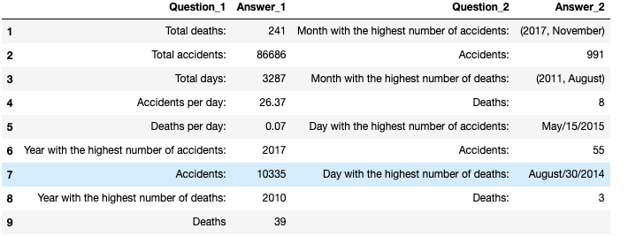
- Interesting Info accidents/deaths/barcelona.
I just display a chart with some info regarding the accidents.
Location Based Analysis
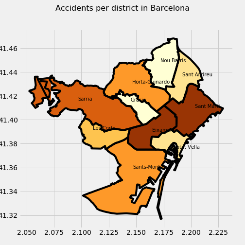
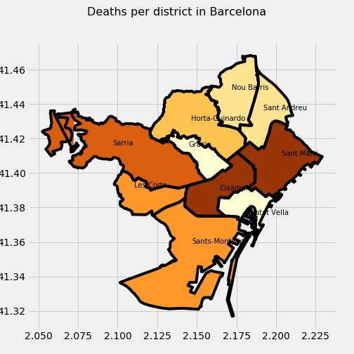
- District.
I will analyze accidents and deaths by district in Barcelona. I will show 3 plots, the value to measure in each one is: accidents, deaths or ratio deaths/accidents, respectively. I also classify by color each district a darker color corresponding a bigger value. Important to note how two districts (Eixample and Sant Marti) are the ones with more accidents and deaths …
 |
 |
… but the picture changes when we evaluate the ratio deaths/accident per district. Now we are talking about Les Corts and Nou Barris as the most dangerous districts.
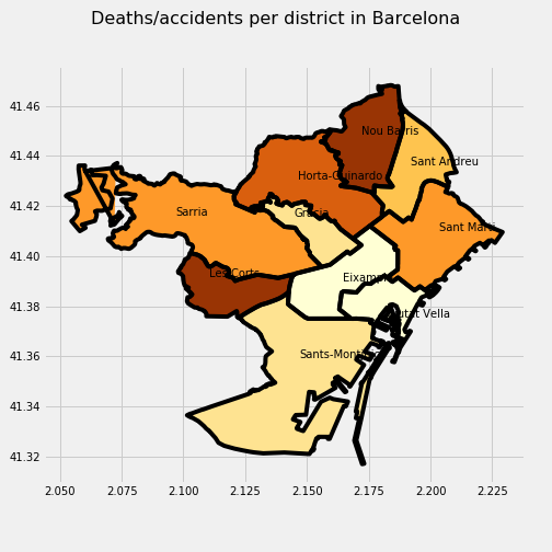
What I realized about Barcelona is that the Eixample district is the one that has a lot of the traffic and therefore the accidents and the number of deaths but if you analyze the ratio of the number of deaths per accident it is really low and Les Corts and Nou Bariis, where there is not a lot of traffic, gets the winning position.
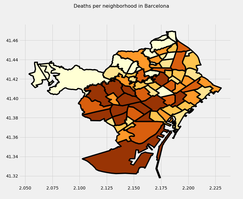
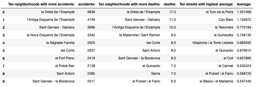
- Neighborhood.
Things change only a little bit when we talk about neighborhoods. The first important change is the number of neighborhoods that is 74 instead of 10 districts. First, we will take a look at the accidents.
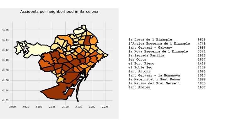
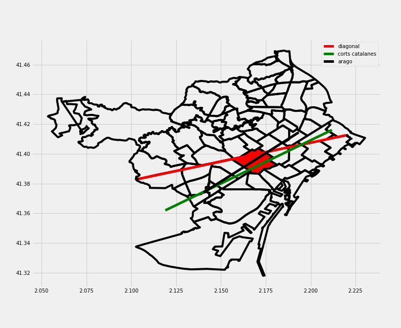
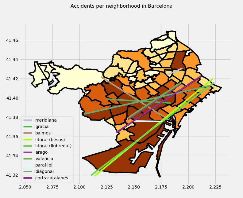
There are some things that jump out: 1. What a hell is doing that red neighborhood in the middle? Sant Andreu neighborhood. The explanation is this: when we split neighborhoods on 6 types by amount of accidents, Sant Andreu just makes it to the first group. 2. How the first neighborhood (La Dreta de l’Eixample) doubles in number the second neighborhood. 3. Do the dark area in most neighborhoods corresponds to the pass of important streets and avenues? I decided to draw Diagonal, Corts Catalanes and Arago (the three streets with more accidents) on top of the map with la Dreta de l’Eixampla in red to confirm it.
Also, as it happened with the districts, those neighborhoods with the higher numbers of accidents and deaths DO NOT correspond with the neighborhoods with a higher deaths/accidents ratio.
 |
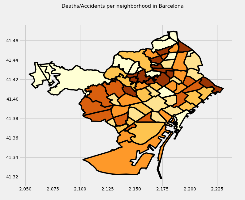 |
Let’s have a look at the top 10 in each category so we can put a name on them and also ratify what we already know and/or imagine: the neighborhoods with the highest number of accidents and deaths do not have (except for 2 cases) the highest value for the ratio deaths/accidents. I create this table because I think it is better to work with than charts.
I did not want to finish this part without showing( via a python script) how they do barely have any common elements:
How many of the neighborhoods with more accidents have also a high rate death/accidents?
most_accidents = set(neighborhood.sort_values('number_of_accidents', ascending=False).head(10).index)
most_ratio = set(neighborhood[neighborhood['number_of_accidents'] > 100].sort_values('deaths_per_accident', ascending=False).head(10).index)
most_deaths = set(neighborhood.sort_values('number_of_deaths', ascending=False).head(10).index)
def common_member(a, b):
    a_set = set(a)
    b_set = set(b)
    if (a_set & b_set):
        print(a_set & b_set)
    else:
        print("No common elements")
common_member(most_accidents, most_ratio)
common_member(most_deaths,most_ratio)
Being the outcome:
No Common elements
{‘el Guinardo’, ‘el Putxet i el Farro’}
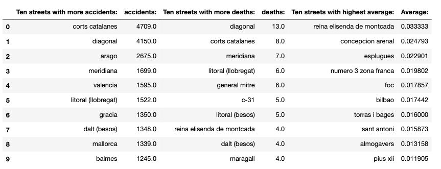
- Streets.
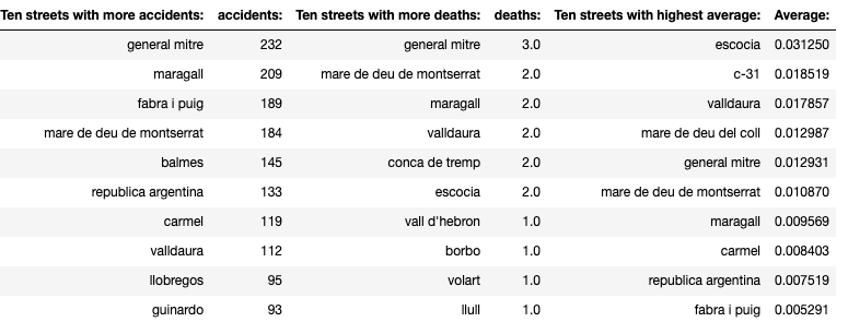
I do not want to repeat myself again so I will go straight to the point: street follows the relationship with accidents, deaths and its ratio the same way than the neighborhoods did. It means that the streets that have the highest numbers of accidents and deaths are not the ones that have the highest numbers when it comes to the ratio death/accidents (considering only the streets with more than 100 accidents in the latter). The other consideration to be made: I made an analysis of the effect of the cross roads in the accidents and included them in the calculations made afterwards in the streets and their impact in accidents and deaths. Finally, I did a fairly good work cleaning up the names of the streets but some small fixes might be still pending.
Once added all the cross roads as streets:
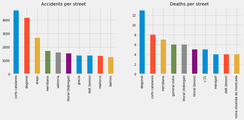
This the outcome when we analyze the streets with its ratio:
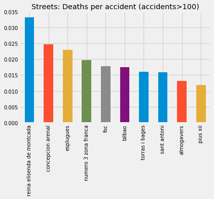
Once again, the 10 streets with more accidents are not on the top 10 when it comes to ratio death/accidents and only Reina Elisenda is on the top 10 by deaths and ratio.
- Neighborhood & Streets
First, what are the most dangerous streets in the most dangerous neighborhoods?
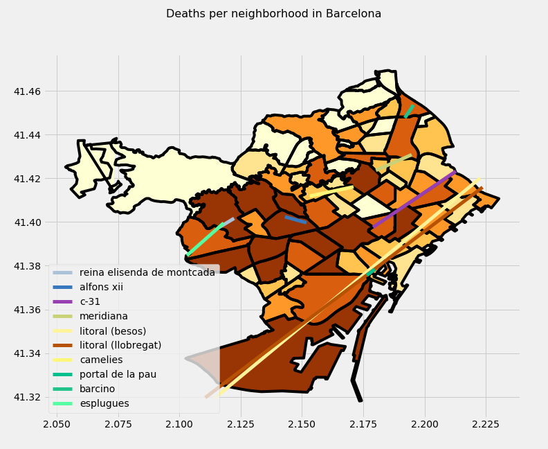
To shed some light into the relationships neighborhoods and street, I plotted on top of the charts of the classification by neighborhood the streets more active in accidents, deaths and ratio.
Accidents:
Deaths:
Ratio:
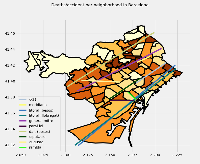
Conclusion:
While the streets with more accidents and deaths are the most important streets of the city that receive most of the traffic, the street with the highest rate of deaths per accident are secondary streets where the traffic is less. And this happen after I eliminate the streets where there have had, at least, 100 accidents.
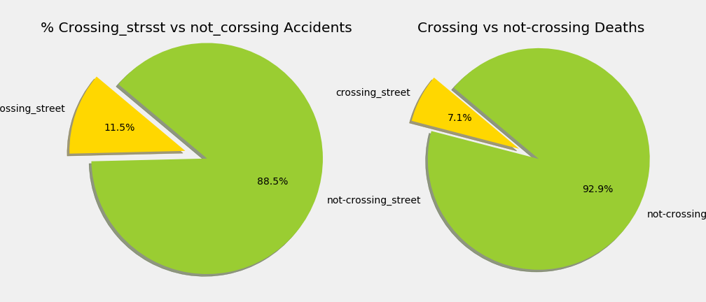
- Crossing versus non crossing Streets
Let’s analyze if the fact that the accident takes place in a crossing, has influence in the outcome of the accident.
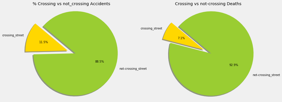
As a consequence, if we add crossing streets as 2 separated streets, how does it change the outcome on the ratio per street?
-
Pedestrians
-
Let’s have a closer look at the number of deaths and injured per accidents.
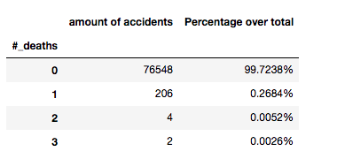
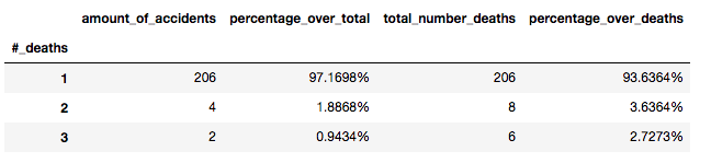
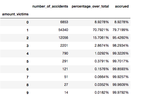
- The accidents that have deaths are very small (less than 1%).
-
It is obvious that it these circumstances one or two accidents with a higher than the normal number of casualties might have a significative impact overall. In this chart we can see what I mean: only counting the accidents with fatalities, the accidents with one are over 97% of the total.
-
It is also important to point out that the number of accidents that have people injured (minor, severely or dead) are not that small compared with the total.
-
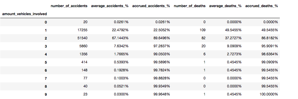
What about the vehicles?
First of all, it is important to mention that the accidents that involved more vehicles are more likely to have more people affected and therefore victims. In other words: for an accident to occur you at least need a driver per vehicle. Obviously, the probability of having more vehicles involved in an accident decreases but at the same time when it happens it is more likely to affect more individuals.
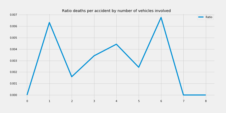
Said that, I just show a plot with the ratio of deaths per accident per number of vehicles. I stopped at 9 because there is an outlier: one accident with deaths and 9 vehicle involved that throws off everything as you can see in the following chart.
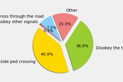
- What about the the field “pedestrian cause”?
In this dataset, we have a field with the information related to the cause behind the accident when a pedestrian is involved. As I show in the chart, it has over 50% of ‘Unknown” what makes it hard to analyze but let’s have a look at the causes when they are known.